problem
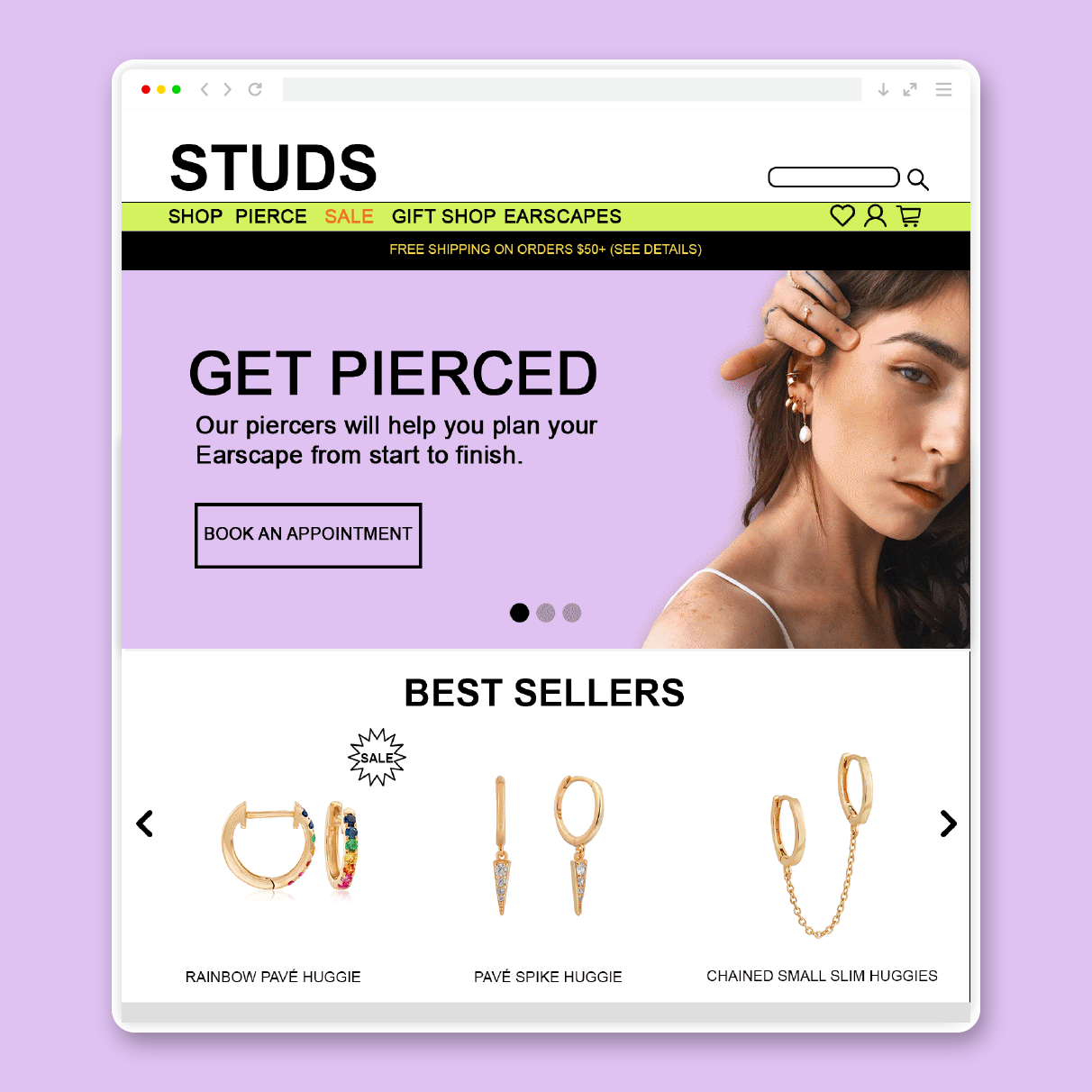
STUDS wanted a banner at the top of their website that immediately caught the attention of website visitors and directed them to their most important sales and actions.
approach
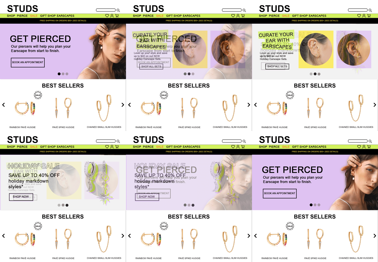
We decided to redesign the upper third of the website and create three different banners which featured their newest sales and most important services.
solution
We gave the upper third of the website a fresh look using STUDS' current design style to improve visitors' first impressions of the site in the first 5 seconds of landing on the homepage in order to decrease bounce rate. Then, we added a moving image carousel to incorporate all three banners in the upper third of the site to guide users towards STUDS' most important calls to action and increase customer conversion rate.

