problem
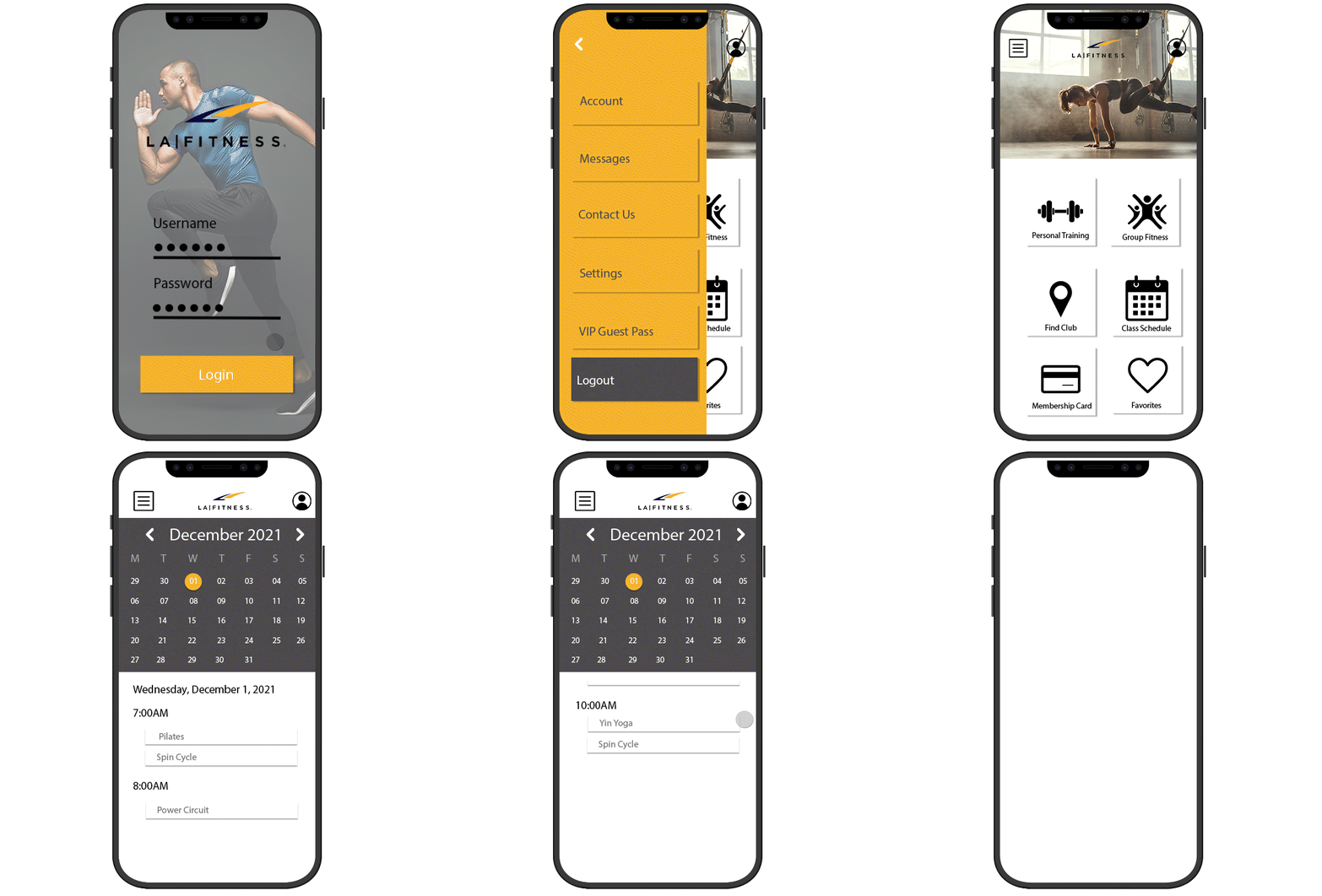
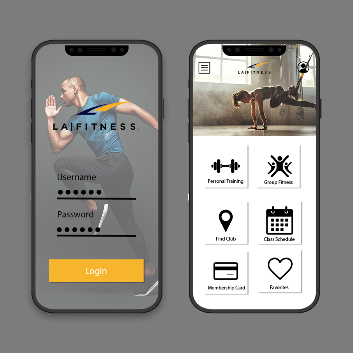
LA Fitness wanted a new mobile app design that was less cluttered and easier to navigate.
approach
In order to make navigation easier and more visually appealing, we decided to remove redundant links/pages and add transitions that made the buttons and other user actions more intuitive to use.
solution
The redesign gives the app a cleaner, updated look that features animations that respond to user actions in a way that users expect. Thus, improving the user experience by eliminating confusion, making the experience more intuitive and seamless, and ultimately increasing the time that users spend using the app.

