problem
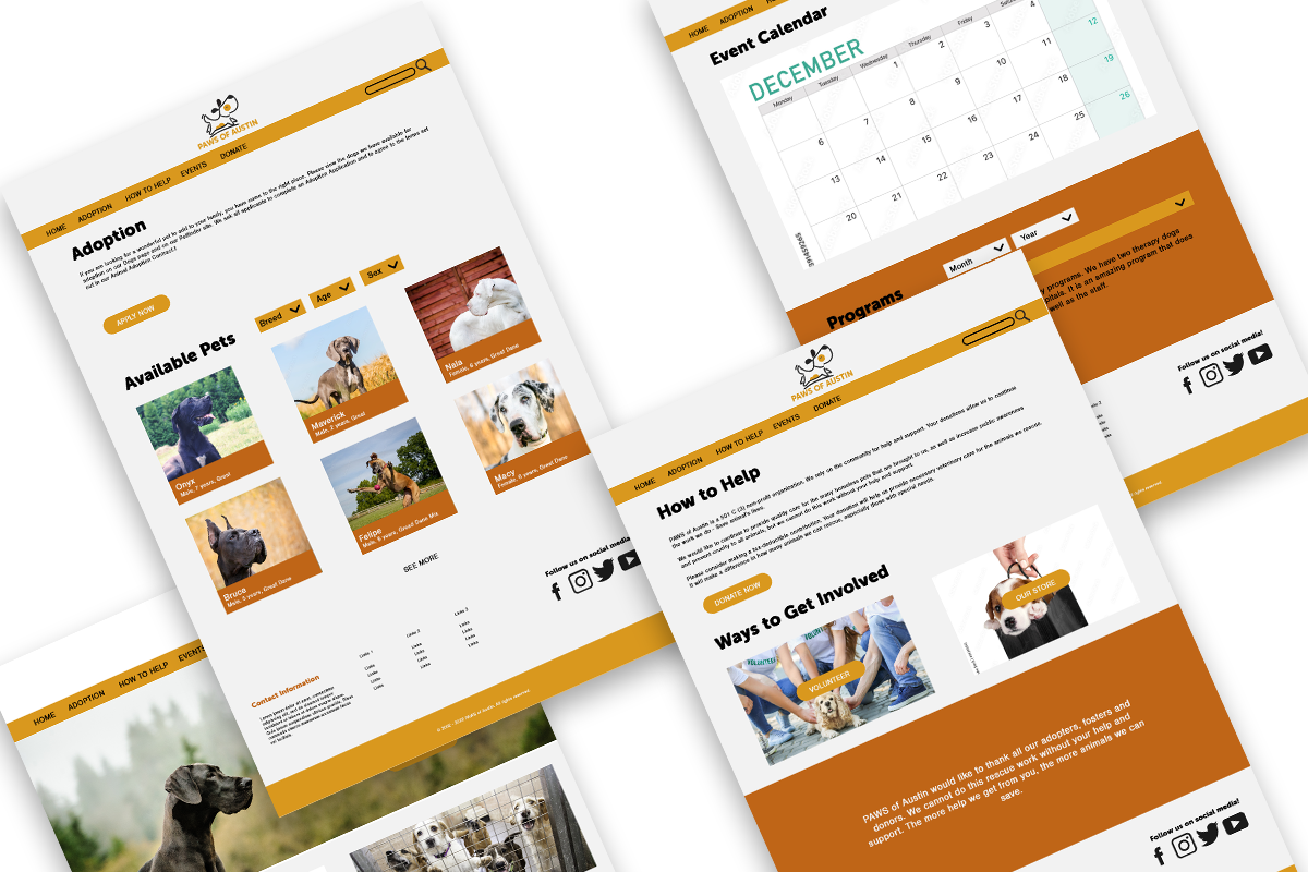
PAWS' old website was outdated in both look and functionality. The website was also bogged down with lots of text heavy pages that were hard to read and made it difficult for visitors to find information.
approach
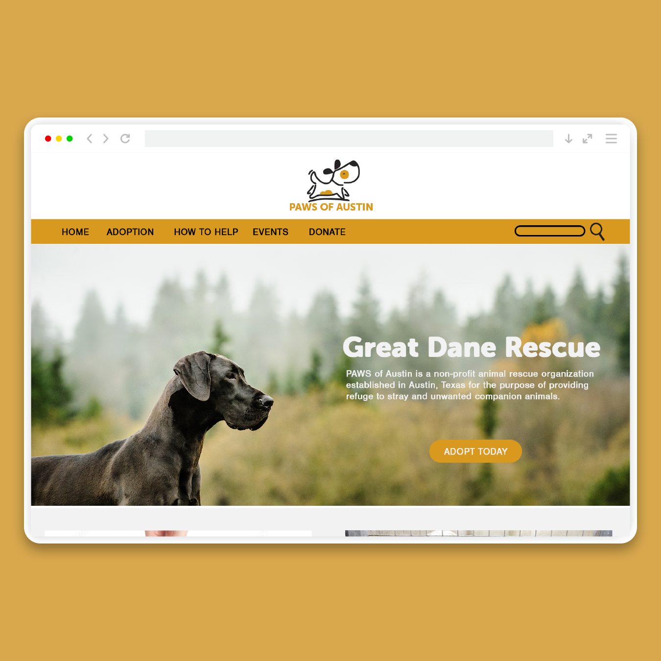
They needed a fresh, brighter look that set a more welcoming, friendly tone and a new navigation menu and page layout to help users quickly find the information that they were looking for.
solution
We redesigned the site with a brighter color palette, more playful typography and high-quality images that gave the whole site a warm, inviting tone. We also updated the site to be responsive, added functionality to the adoption and events pages, and addressed navigation issues by forgoing redundancies in pages and textual content and replacing them with images and visually hierarchy to make the whole website easier to navigate.

